Client
Farmington Tourism
Client
Lorem ipsum dolor sit amet, consectetur adipiscing elit, sed do eiusmod tempor incididunt ut labore et dolore magna aliqua.
Service
- Digital Marketing & SEO
Service
increase in sessions
increase in new users
increase in organic traffic
Farmington TourismVisit the site
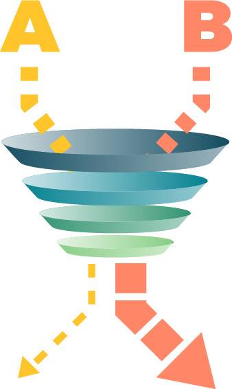
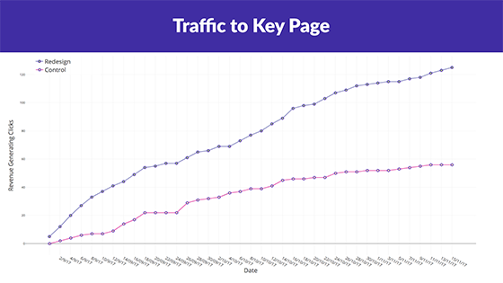
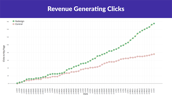
Consumer51 was able to increase revenue-generating clicks on our client’s site by 358%. How, you ask? Science! Specifically, we performed an A/B test to compare our hypothesized design changes against a control. As a full-service team of marketers, designers and web developers, we were able to address a wide range of pain-points in order to funnel visitors towards our client’s key page.
A/B testing
A/B testing is a process of comparing two versions of a product (in this case, a website) against each other to see which performs best. It’s important to note that these tests work best on pages with high traffic. Getting enough data is crucial to get statistically meaningful results.
Because we were focusing on a whole customer experience through the site, we made sure to optimize the homepage first, that way we could drive more traffic to the valuable page where users could actually view the content.
Meet the client
Farmington Convention and Visitor’s Bureau (CVB) is a tourism agency in Northwestern New Mexico. Their goal was to increase views of their travel planner, which is a primary source of advertising revenue for the organization.
Understanding their target audience helps us to create designs that are actually relevant. Specifically, their viewers are often on a road trip, looking for information about a destination. As such, prioritizing the travel planner on mobile was key.
The challenge
We approached Farmington CVB’s goal in two steps, with the first one designed to increase traffic on the second page as much as possible.
- Drive as much relevant traffic as possible to the travel planner page.
- Make it as easy as possible for users to view the travel planner.
The solution
1. Drive as much relevant traffic as possible to the travel planner page
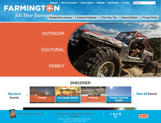
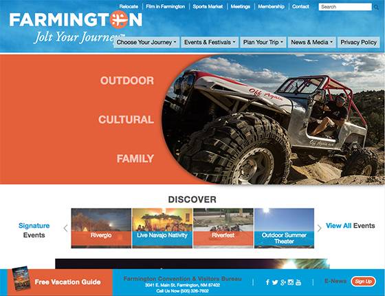
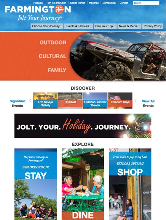
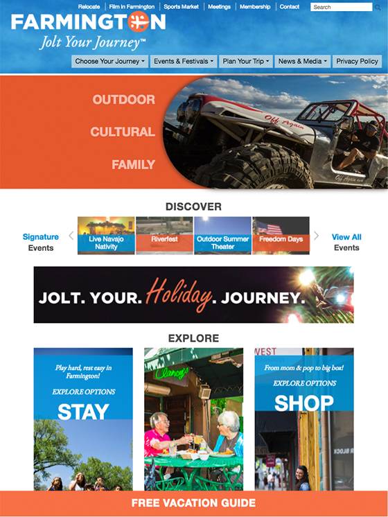
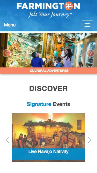
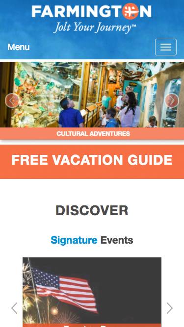
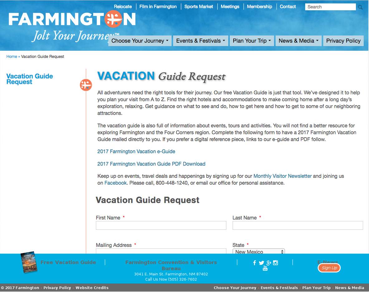
Our designer subtly rearranged the page in order to make the travel planner link highly visible on all devices. This included animation on desktop, adding a brighter color, and moving the travel planner link high up on the page on tablet and mobile.
2. Make it as easy as possible for users to view the travel planner
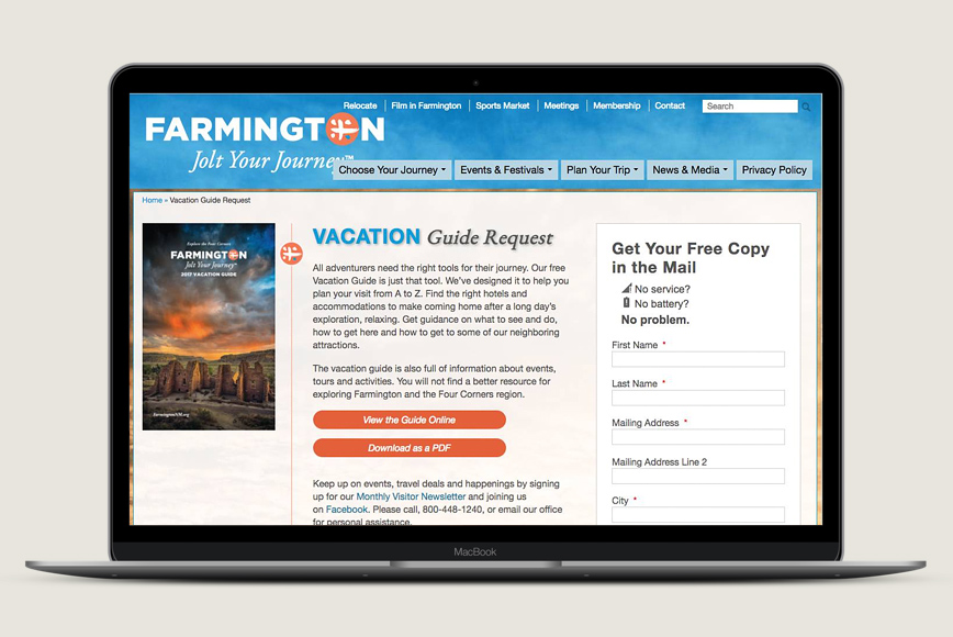
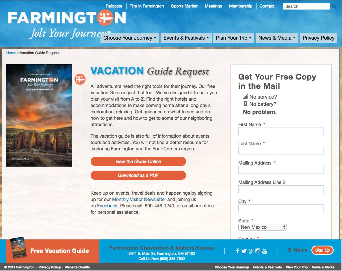
There are three ways a user can interact with the travel planner: download it, view it online, and have a physical copy mailed to them. First, we made all three options into clearly visible buttons, rather than burying them as links within a large block of text. Second, we improved the usability of the form and rearranged the layout so that it was visible above the fold on large screens.
The Results
Over the same three month period of time, traffic more than doubled to the key landing page.
With double the traffic, we had enough hits on the Travel Planner page to move ahead with an A/B test for the second goal. The design changes to the second page doubled views of the travel planner.
While there are several pieces that are involved in creating a successful website, none are more important than user experience. As seen from the results of this particular case study, getting user experience correct can completely change the future path of your business.
Do you have a website that could use some improvements, or are you interested in learning more about the user experience on your site? A/B testing can be performed on any site, and nothing gives you more confident insight into your consumer’s needs and desires. Consumer51 can help formulate a strategy that will uncover exactly what your clients are looking for when they land on your site.
Increase in traffic to priority content
Increase in form submissions
Increase in online views
Additional downloads
